Today on the Salesforce Admins Podcast, Admin Evangelist Josh Birk sits down with Kat Holmes, Chief Design Officer and EVP at Salesforce. Join us as we chat about diversity, accessibility, and her book, Mismatch: How Inclusion Shapes Design. You should subscribe for the full episode, but here are a few takeaways from our conversation with […]
Latest Blog Posts, Podcasts and Videos
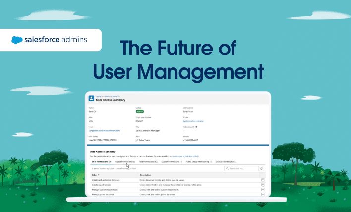
Summer ’24 is almost here. Learn more about user management below and check out Be Release Ready to discover more resources to help you prepare for this release. Welcome to a new era of user management! At Salesforce, we believe in the power of community-driven innovation. Your feedback as Trailblazers is invaluable—it’s the compass that […]

As an admin, you’ve probably heard of Data Cloud, but maybe you haven’t prioritized it right away because you have other company challenges to address. Well, now’s the time to move Data Cloud to the top and dig in. If you’re thinking, “What is Data Cloud? Can you break it down for me?”, you’re in […]
Start Your Admin Career

Salesforce Administrator Profile
You solve business problems by customizing the Salesforce Platform. You build, configure, and automate technology solutions to deliver business value. Core responsibilities include supporting users, managing data, maintaining security standards, and delivering actionable analytics.
Expected skills
User ManagementData ManagementSecurityData AnalysisBusiness AnalysisChange ManagementProcess AutomationDesigner’s MindsetProblem SolvingCommunication
Get Started
Dive into Product Resources for Admins

Visualize data and drive insights with Einstein Analytics, Reports & Dashboards, and Tableau.
Learn More

Create end-to-end workflows for any industry with declarative process automation.
Learn More

Connect apps and data to Salesforce and automate integrations quickly and easily.
Learn More
Get release ready with all the resources you need to prepare for the next release.
Learn More
Learn more about Salesforce products


#AwesomeAdmins on Social
Trailhead
Learn in-demand skills that lead to top jobs with Trailhead,
the free online learning platform from Salesforce.
the free online learning platform from Salesforce.
Trailblazer Community
Connect, learn, have fun and give back with #AwesomeAdmins across the globe.